ZadatakTask
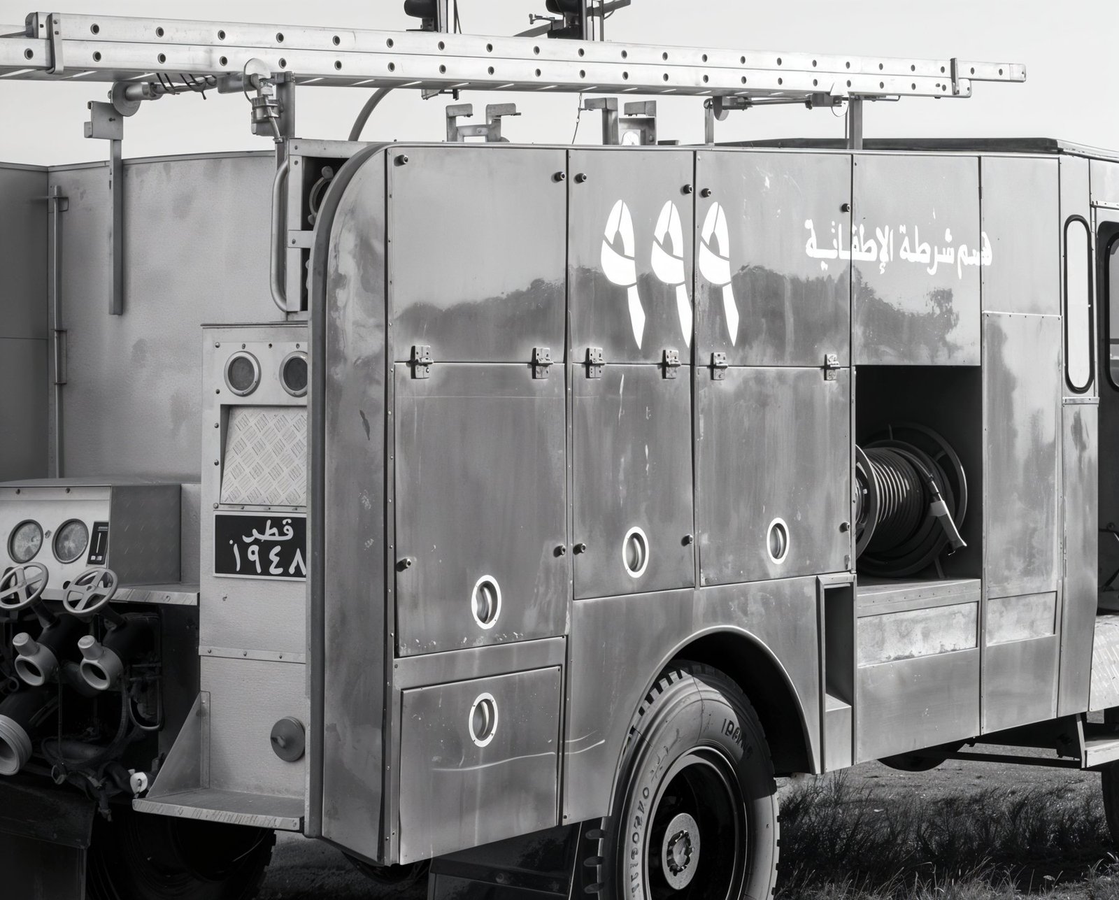
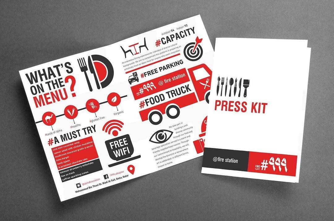
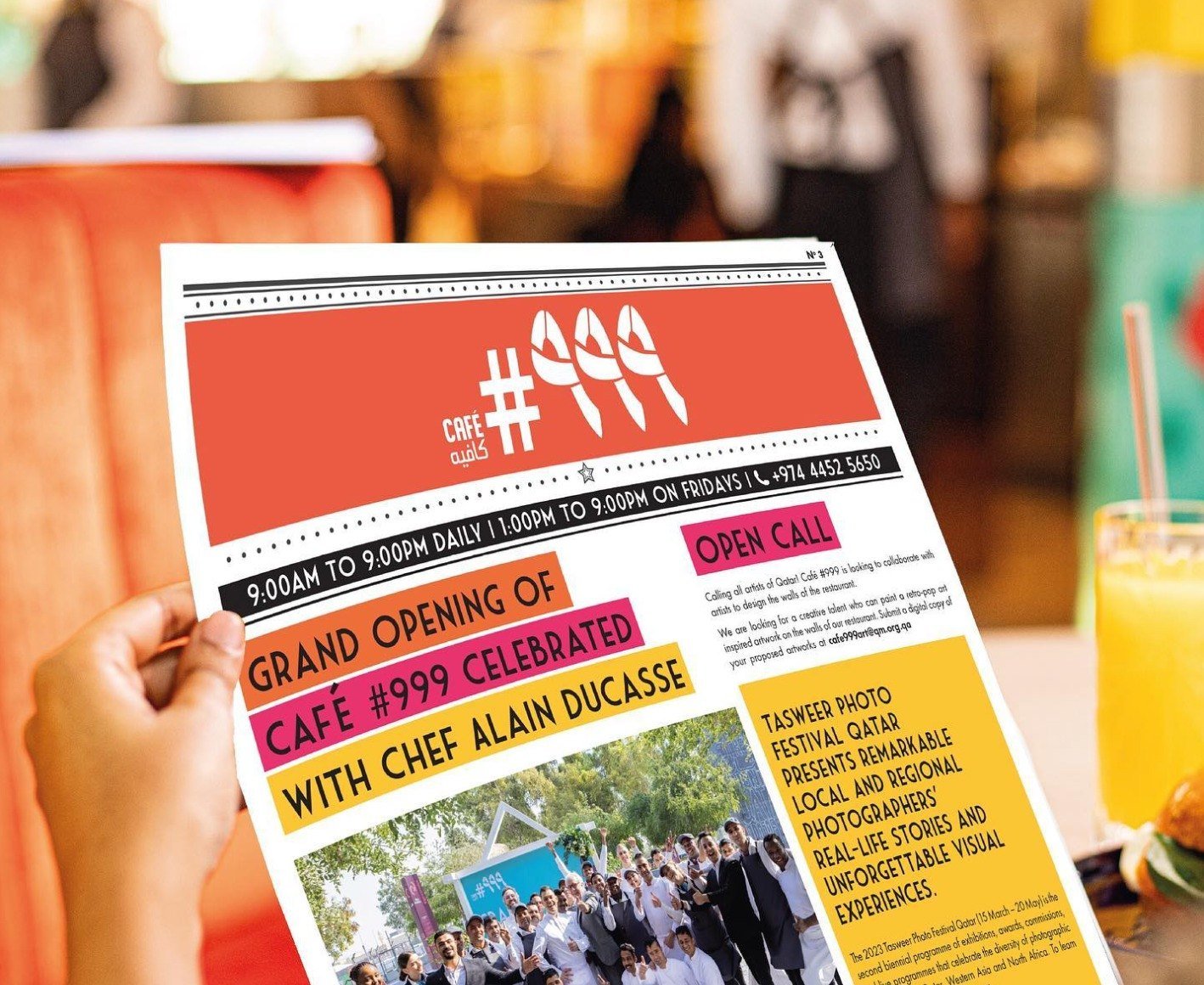
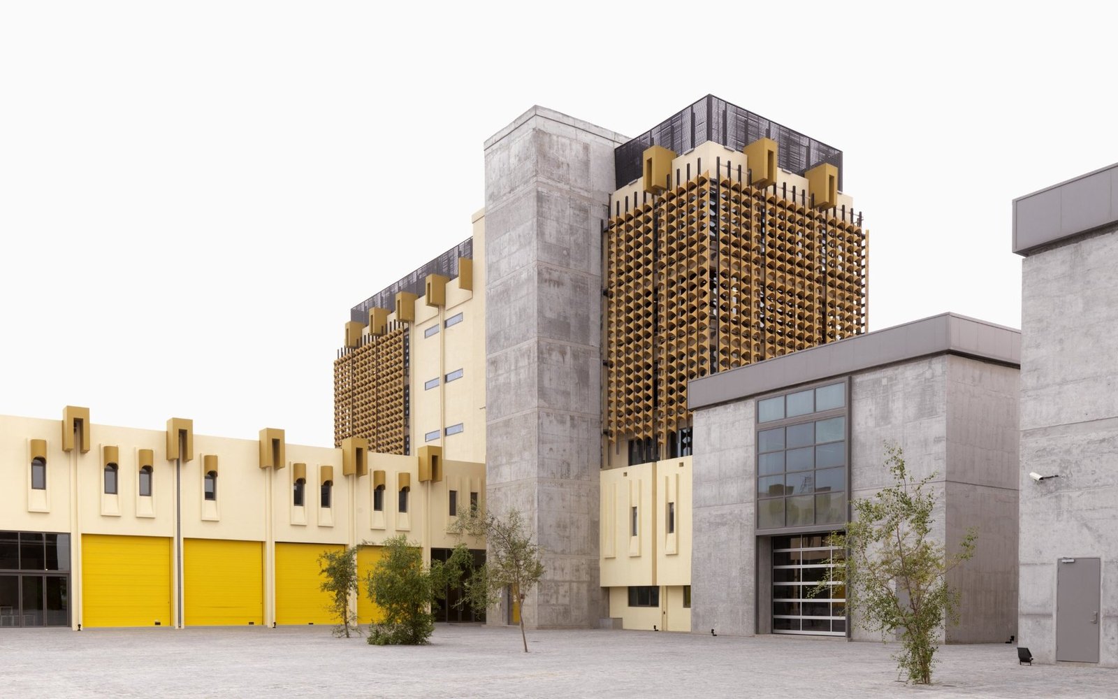
Café #999 je trebao identitet koji može živjeti u veoma specifičnom kontekstu: bivša vatrogasna stanica pretvorena u kreativnu destinaciju. Logo je morao povezati priču prostora, raditi dvojezično i biti dovoljno fleksibilan za signage, print, uniforme, čaše i komunikaciju.Café #999 needed an identity that could live inside a very specific context: a former fire station turned creative destination. The logo had to connect to the story of the space, work bilingually, and remain flexible for signage, print, uniforms, cups and communication.
PristupApproach
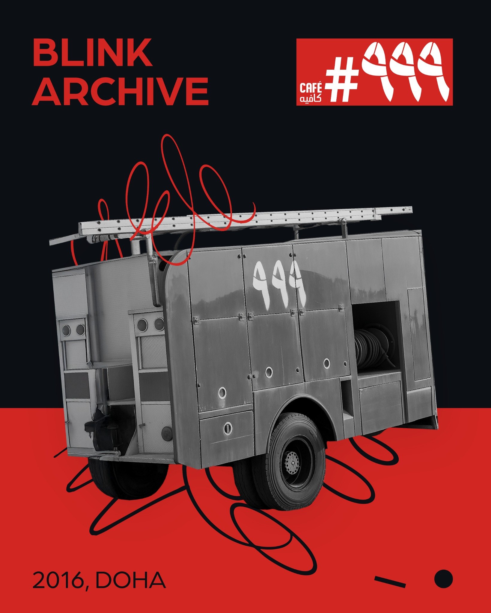
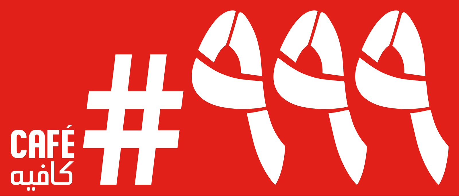
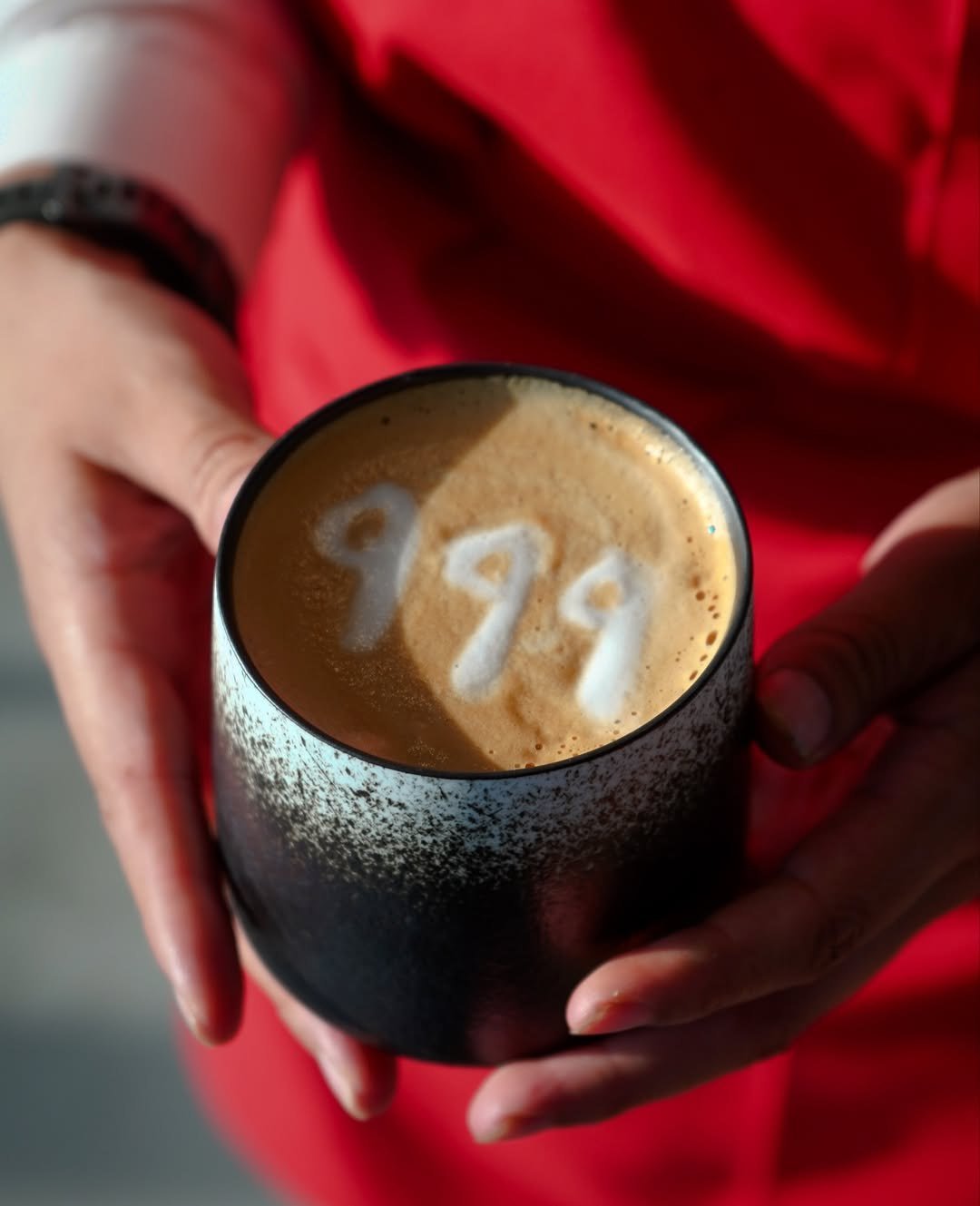
Umjesto generičkog kafe znaka, sistem je građen oko broja 999. Brojevi su postali glavni vizuelni uređaj: dio broj, dio vatrogasno crijevo, dio simbol. Crvena, bijela i crna zadržale su vezu sa vatrogasnim signalima, dok je grafički sistem otvorio prostor za savremeni kulturni ton.Instead of a generic café mark, the system was built around the number 999. The numerals became the main visual device: part number, part fire-hose form, part symbol. Red, white and black kept the link to fire-service signals, while the graphic system gave the identity a contemporary cultural tone.
RezultatResult
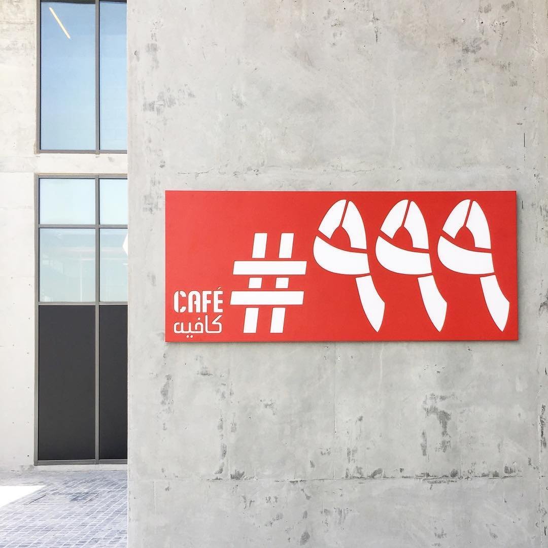
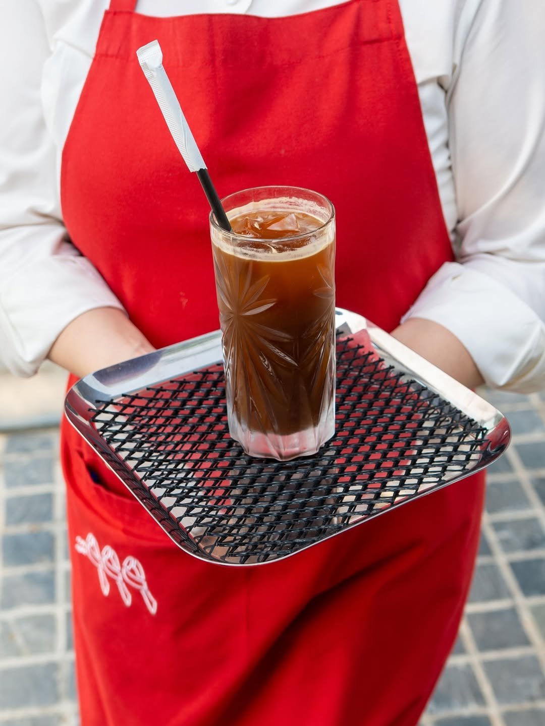
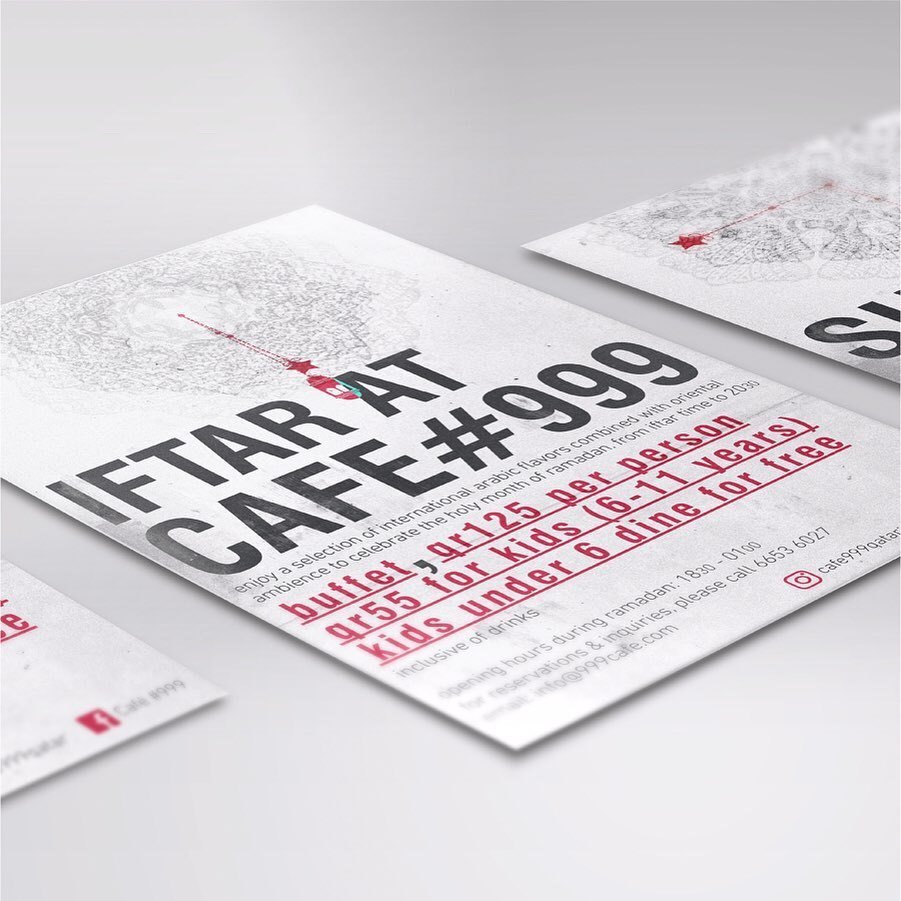
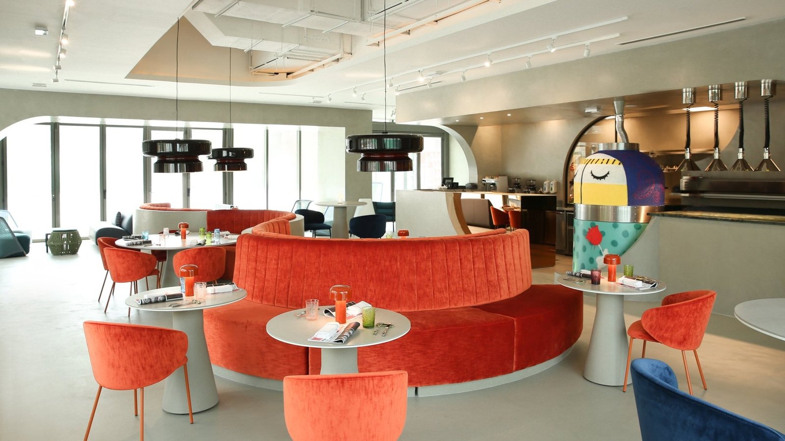
Identitet je zaživio kroz launch materijale, signage, štampu i servisne detalje. Godinama kasnije, koncept restorana se mijenjao i razvijao, ali je osnovni Café #999 znak ostao prepoznatljiv dio prostora.The identity lived across launch materials, signage, print and service touchpoints. Years later, the restaurant concept evolved, but the core Café #999 mark remained a recognizable part of the space.